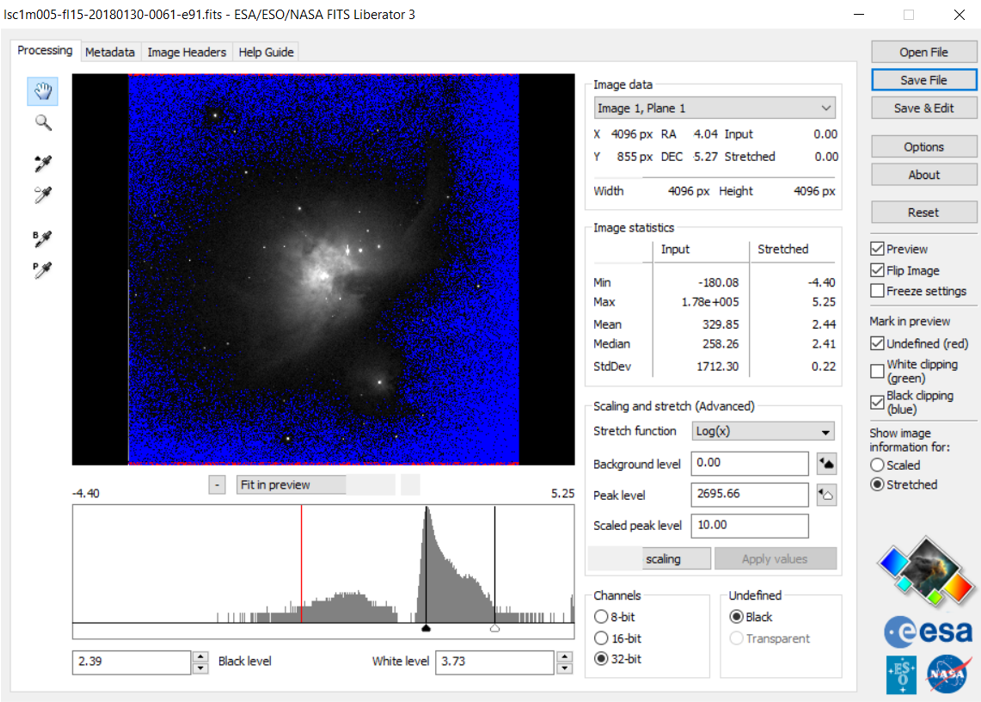
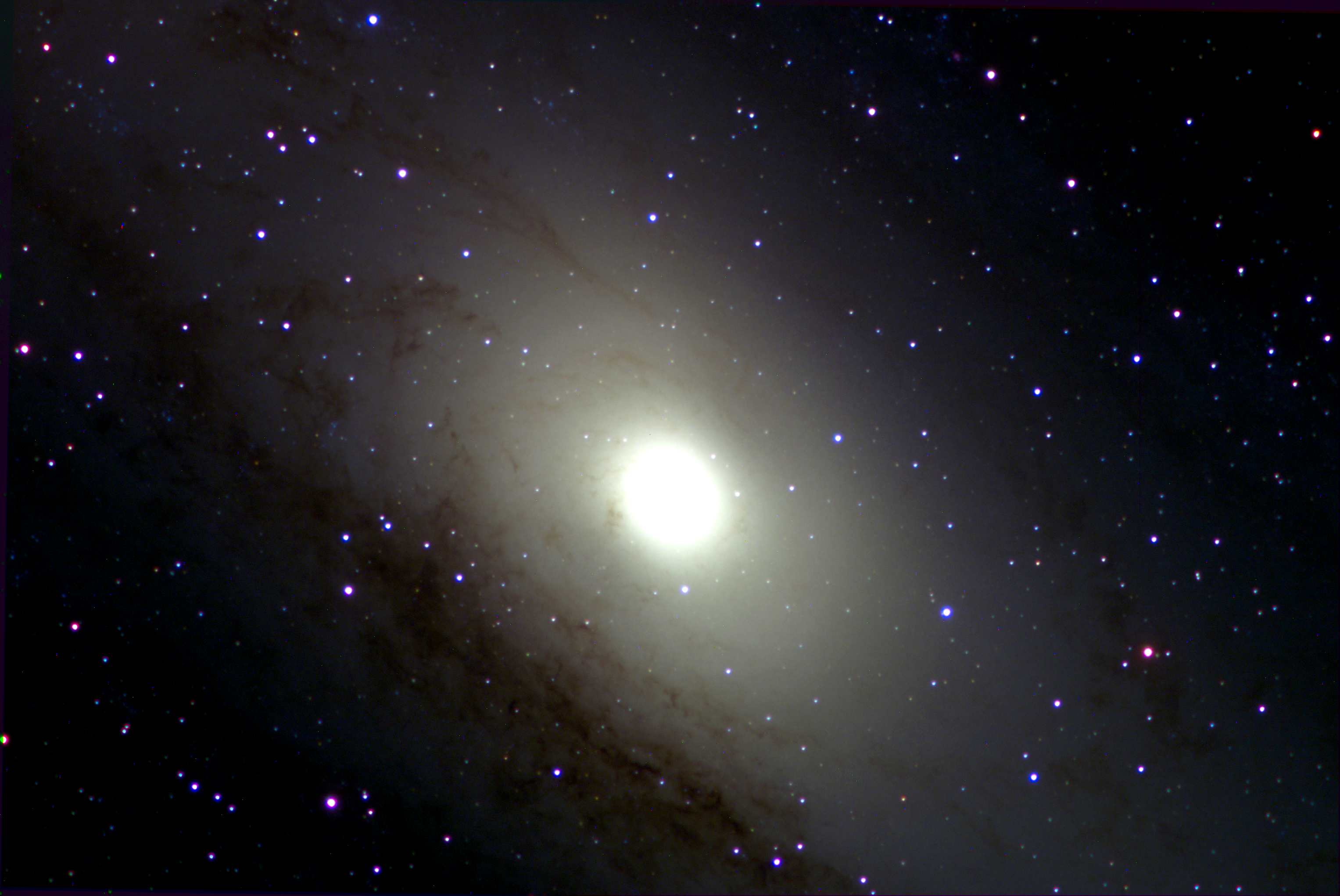
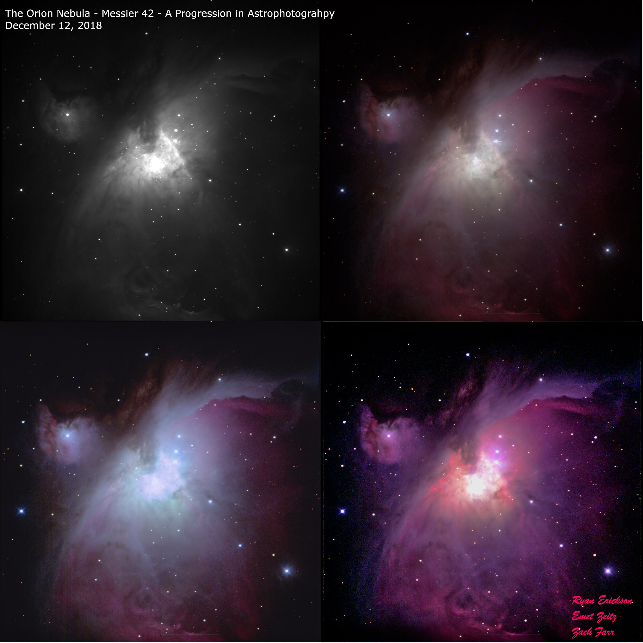
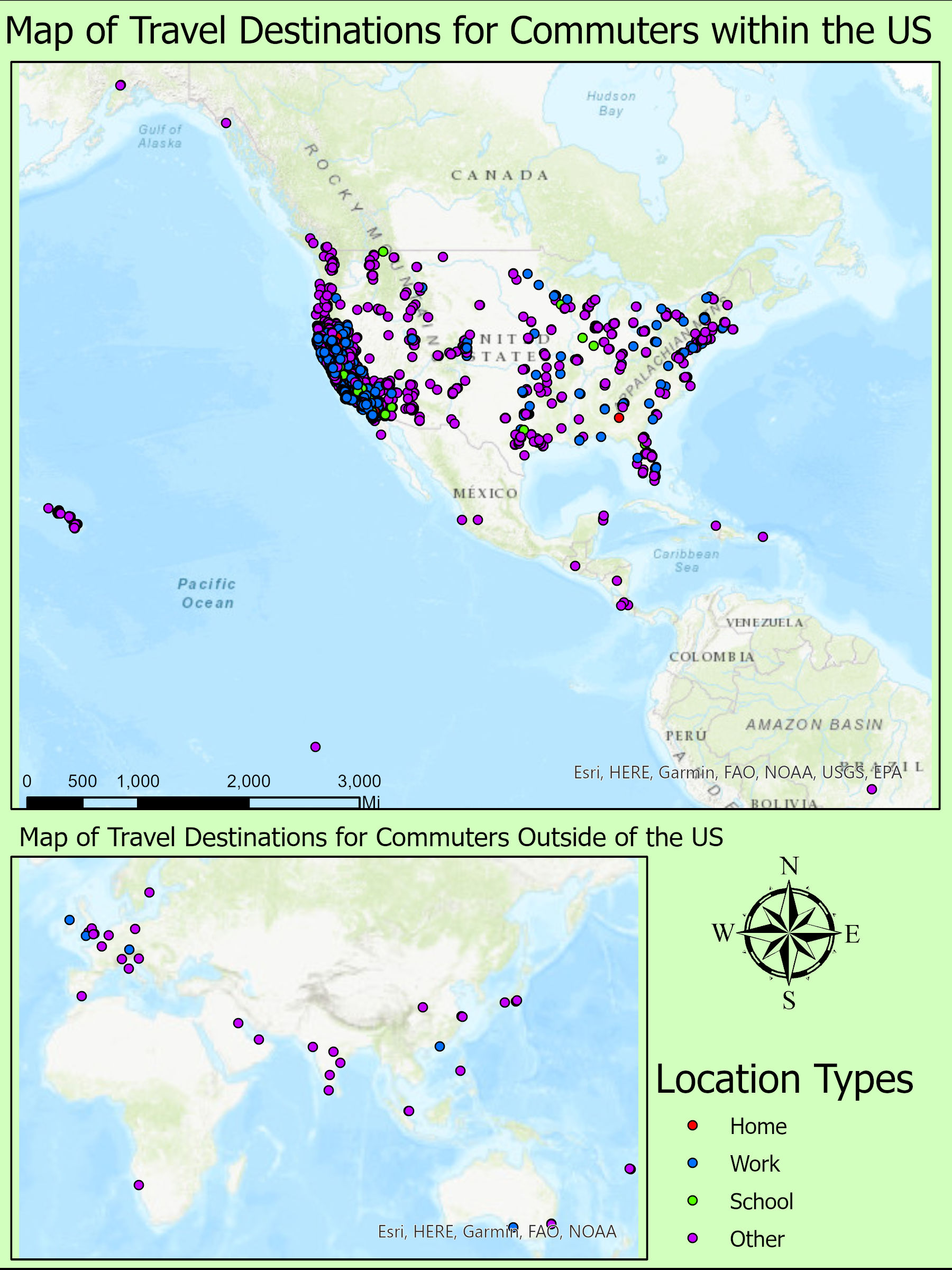
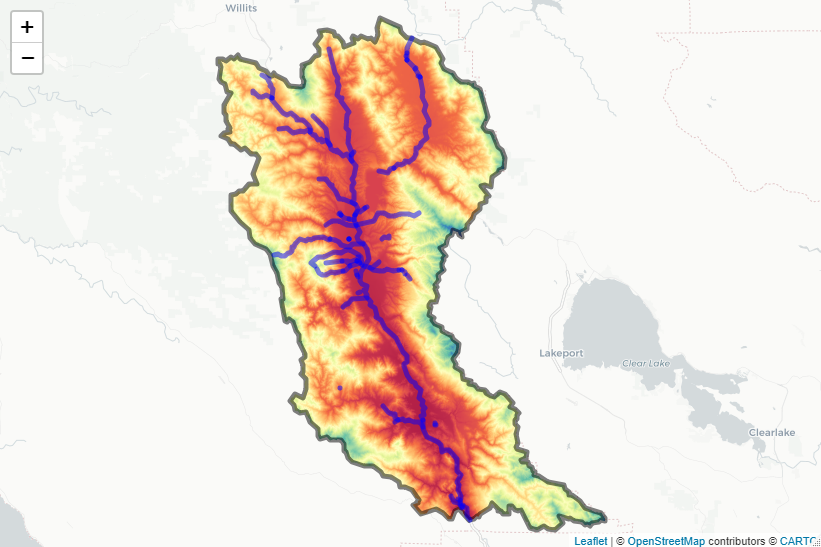
Research Interests and Presentations

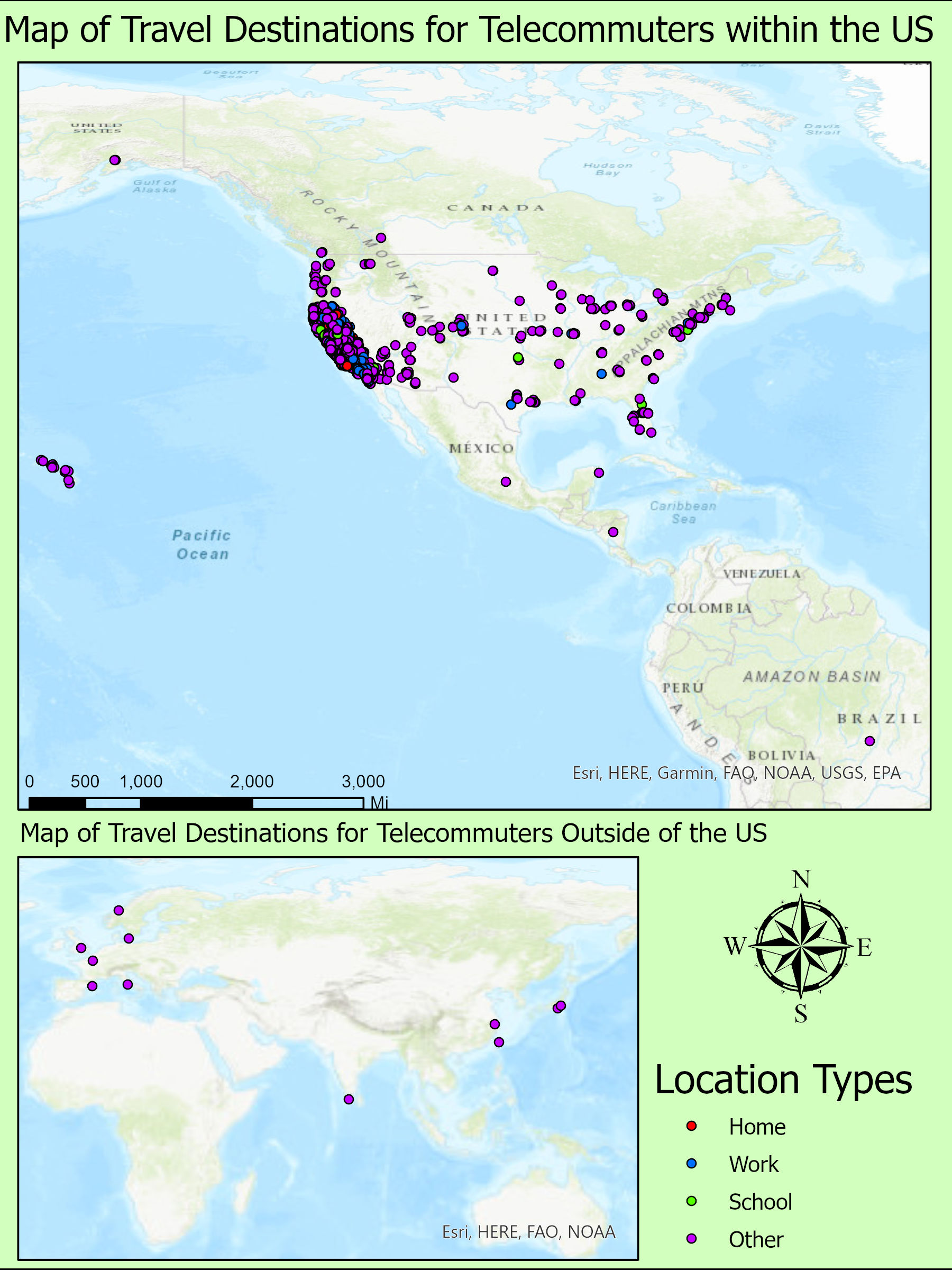
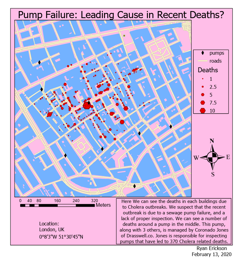
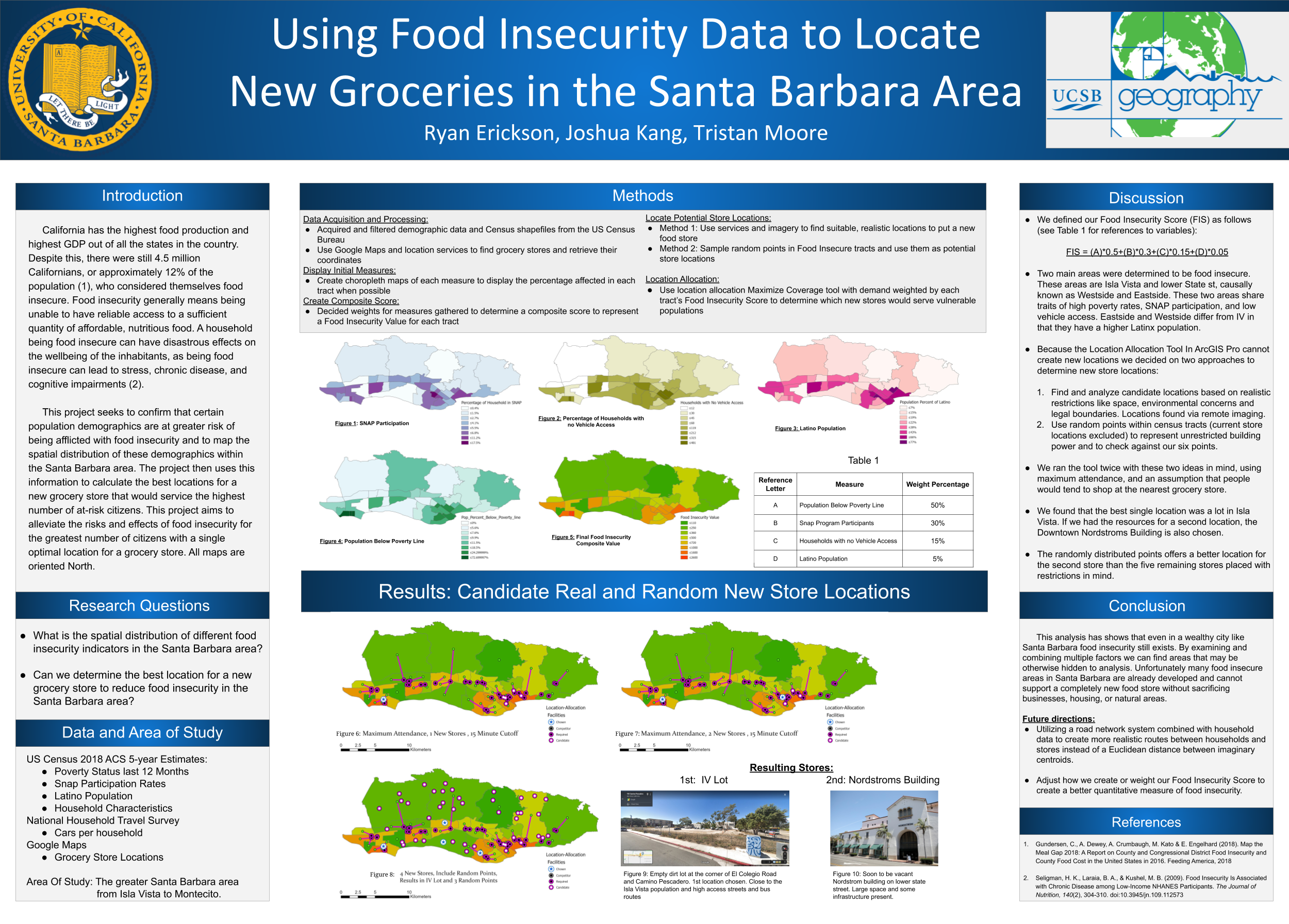
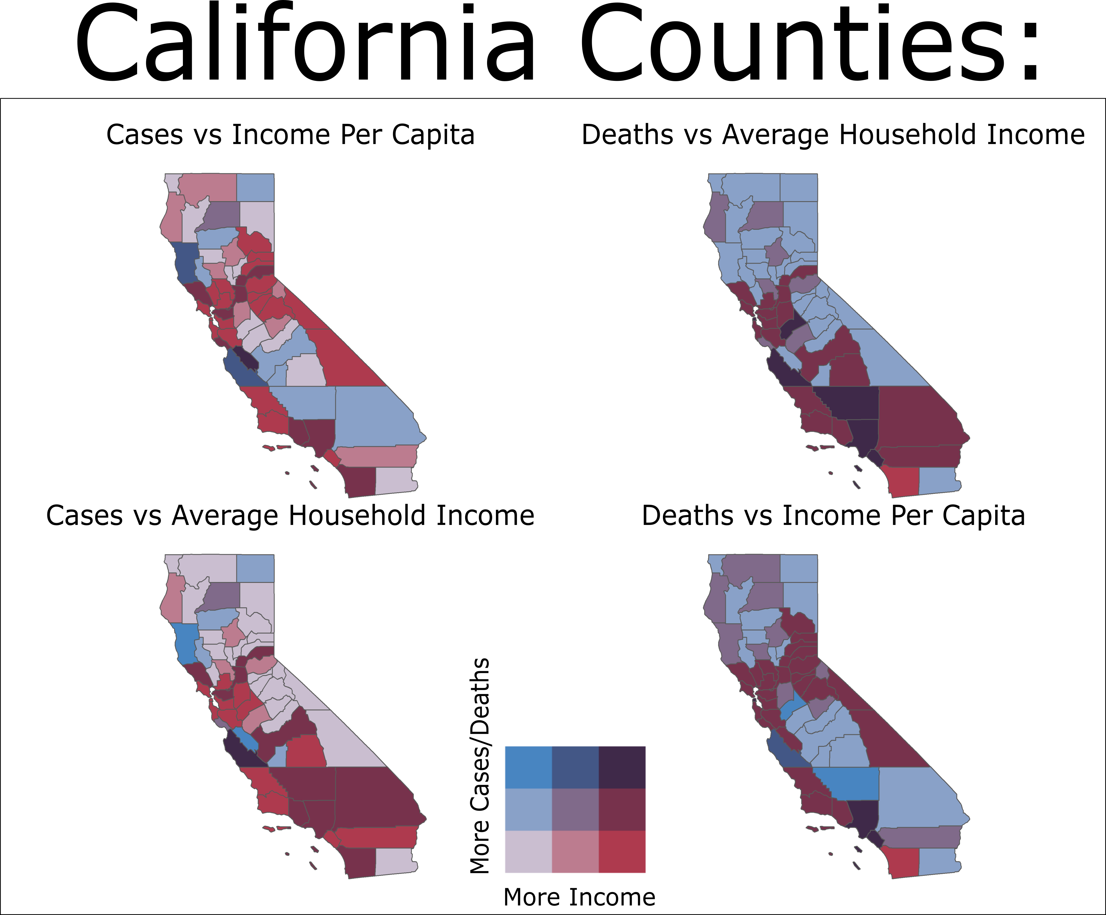
These are some projects I've done through out my time at UCSB.

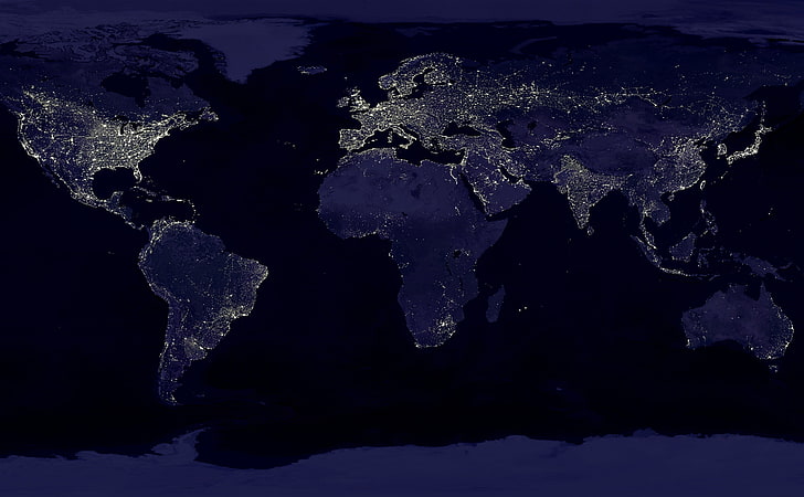
I double majored in Geography and Physics and wanted to highlight both accomplishments. I decided to add some of the more interesting physics related projects as well as the early research based in Geography.

Physics

Univeristy of California, Santa Barbara

Astrophysics

I made many of these images from collections of various .FITS files gathered from the Las Cumbres Observatory (LCO). After failing quantum mechanics not once, but twice, I transitioned from the common B.S in Physics to a more uncommon B.A. This allowed me to relearn quantum mechanics from a larger point of view. The next semester, I enrolled in an astrophysics class which focused on observational methods and data structures. I was very new to the concept of programming at the time, which was well recieved by the professor. They taught the class Astroart and convinced me to enroll in another class of theirs, optics, which focused on the program dbOptic. The latter introduced me to ray-tracing simulations and lense design. The former resulted in many fun side projects and offered a different perspective on quantum mechanical interactions from a simplified introduction to condensed matter physics.


Astroart

Astroart 9 is a program commonly used for image processing, analysis, astrometry, photometry, camera and telescope control. Using the star atlas map it provides, we set a series of reference stars with known magnitudes. Using astroart, calculations of unknown magnitudes can be used for the stars accross the rest of the image. Using the calculated B-V magnitudes of those stars allows one to calculated the associated temperature for use in light inteisity conversions. These allow the .fits file to be represented as a .tif file, allowing for further post-processing of the images in software like GIMP.

It took many trials but I was finally able to grasp the concept of programming from an extremly unlikely source. Many of the submission materials and requisition forms are formatted in XML, and the programs we used simply helped structure it in a more digustable manner, such as "click and play" programs like Astroart.


Andromeda Galaxy

The class had access to the network of telescopes from the LCO and we were allowed to put in requests to objects in space. This particular final project ended in the tracking of 4-Vesta, one of the largest and most massive asteroids in the asteroid belt. Using photoshop tools like the GNU Image Manipulation Program (GIMP), layers representing red, blue, and green (RBG) intensties can be overlaid to produce the expected color of the image if one were to be close enough to the entity to observe it. Once the basic shape of Andromeda was seen in my image, I decided to move on to a closer object.

Wiki for comparison

My Final Project


Orion Nebula

I'm often asked if my name has a relation to anything. As it turns out, I am not named after Orion, but that would be cool! After I completed refining the image of M31, I noticed Orion's Nebula (M42) was one of the most photogenic objects in the visible night sky. I decided to gather recent imagery of it and refine my own version of it.
The slides for the final group project can be seen here. As a three person group, my classmates and I descibed the mathematical and theoretical reseasoning behind how the images were gathered, processed, and analyzed to depict moving objects in space. During my time in these labs, I also started taking physics related courses in Geography. My first class, physics of oceanography, started my pursit of Geography in academia.


Biophysics


ArcMap

Maps I created in ArcMap Pro, by ESRI

Geog 199

This is from the independent studies class I took with Kostas Goulias. Here I had to go through NHTS data to create a spatial distribution of telecommuters and commuters.
The second map isn't much different, depicting telecommuters and their travelling habbits throughout the US.
I did these in ArcMap, and I would have loved to revisit these maps and the data in R, however the COVID 19 pandemic cut the time I was supposed to meet and interact with my adviser.

London Pump Analysis

Here is a map I created in a class at UCSB in which we digitally replicated the Broad Street cholera outbreak, a severe outbreak of cholera that occurred in 1854 near Broad Street in the Soho district of the City of Westminster, London, England. This was an assignment to get us used to the idea of solving problems using the power of GIS. After displaying the locations and numbers of deaths due to cholera, we deduced that the number of these deaths were exceptionally higher near sewage pumps, leading to the theory that these pumps were mismanaged/poorly inspected. These same deductions were the same found by John Snow (not the GOT version) who at that time had found the same results.

Geog 176 Series Result

A poster I created with a fantastic group for my Geography 176C class, the final course in a Geographic Informational Sciences series. Here we had to collect all our own data and come up with a GIS related question/theory, display, and present our findings to our peers. All edits were done in ArcGIS Pro 2.3.x

R and RStudio

Introduction to Geographic Research

California COVID-19 Transmission Rate vs Income Display

This is a basic bi-variate map displaying the case and death relationships to average county income. Here anything that is more red indicates a higher average income, and low average deaths while anything more blue indicates a higher death and case count in areas that have lower average income. There are two types of income data, household income and per capita income to see if there's any variation in results. The case and death counts have also been normalized to 100,000 people, which makes areas such as LA and San Francisco (areas with high counts but due to extremely high populations)

Flooding Analysis Start Map

Here you see the beginnings of a flooding analysis raster. For fear accidentally sharing confidential resources and out of respect for my peers, I did not want to display data that [was] in the process of being published. This is a basic map consisting of a DEM Raster and Poly lines representing the Russian River in California that is the beginning for flood prediction and analysis.